
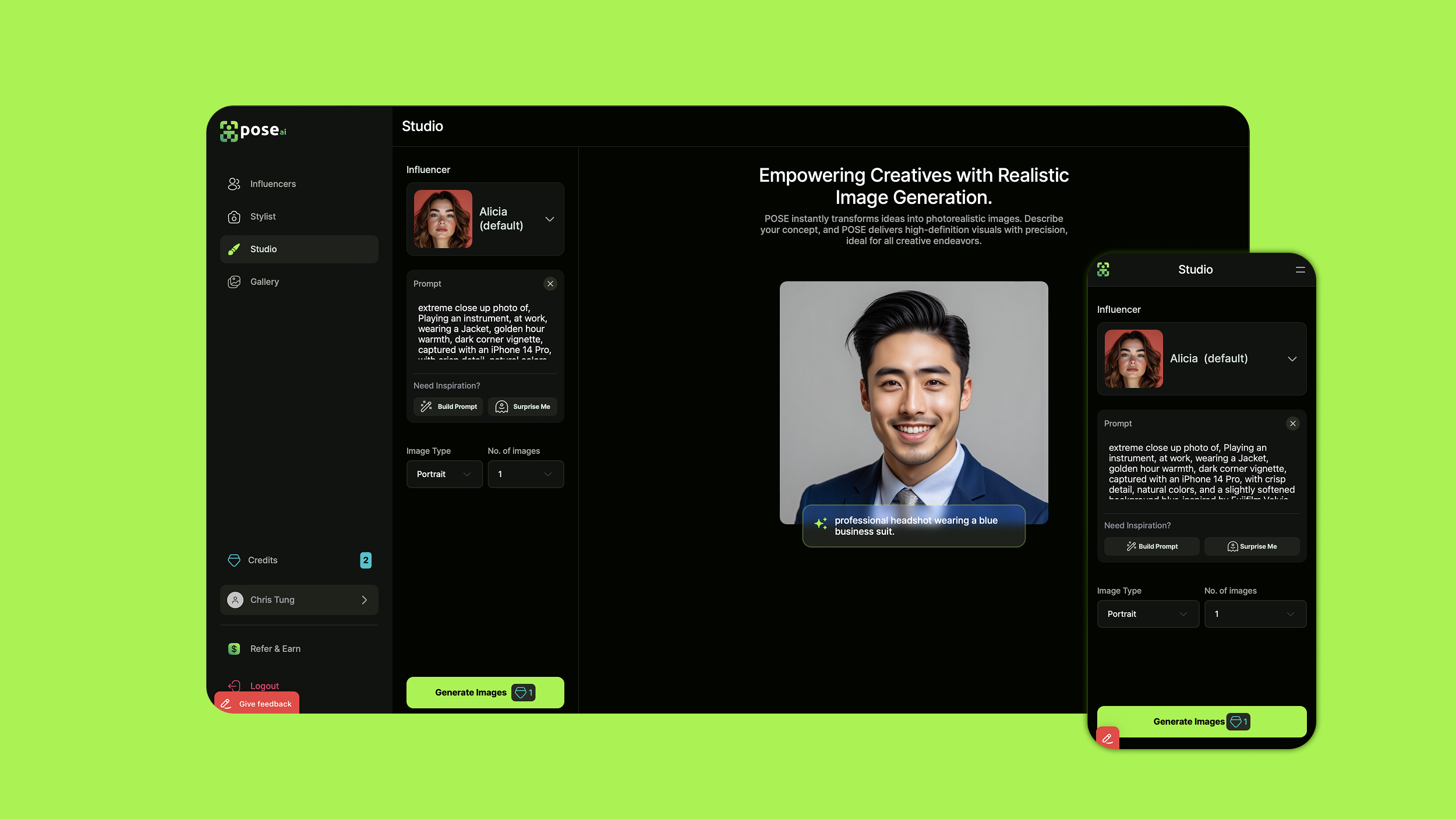
Pose.ai
Photorealistic Image Gen for Influencers

Site: Pose.ai
Designed an AI tool for creating influencer portraits and videos. Aimed to make the user interface and experience simple and smooth. Delivered updates included new features like Stylist (image packs) and subscriptions, along with improvements to photo uploads and the gallery (downloads, filters, upscaling, and watermarking).


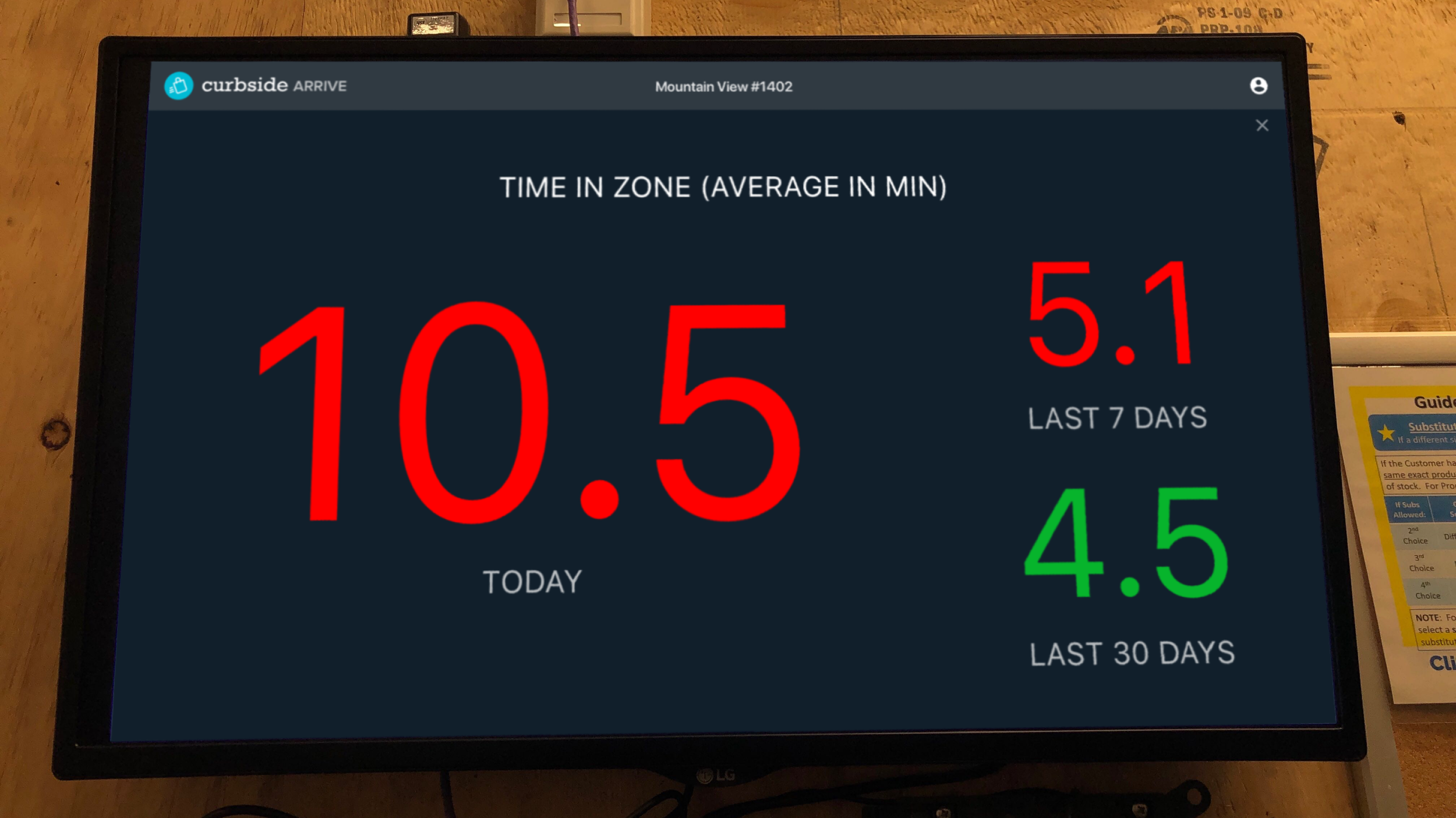
Curbside Dashboard
Developer and Admin UI

Curbside provided a mobile location platform that alerted companies when customers were approaching and arriving at their stores or restaurants. With the Dashboard, management could view customer arrivals in real-time or in aggregate, as well as track customer wait times and store performance. Developers could add and edit store locations, users, API keys, App IDs, usage tokens and webhooks.
Problems
Make it easy for developers to use store data in our apps and manage developer access and usage.
What I did
I improved the onboarding steps for adding store data, both manually and through bulk uploads, making store performance easier to track with Curbside software. I reduced the number of steps and added animations to a complex process, collaborating with Curbside customer support for a smoother experience.


Curbside Console

Curbside provided a mobile location platform that alerted store employees when their customers were approaching and arriving, so employees could have their orders ready to be picked up in-store, at the curb or in the parking lot.
In addition to working on consumer-facing apps, corporate dashboards, and admin apps, I also provided designs for restaurant employee consoles to manage order pickup experience.


Initially, I developed Android app designs that were tested in a proof of concept with Pizza Hut India. We iterated with feedback from teammates who were on location with the client, observing store employees interactions with the app as they prepped and handed off orders to customers.


I then worked on universal Web-based UI that could be used in multiple use cases including retail and grocery stores. This included a larger display of the order list, as well as supporting customizable views that combinations of order list, map and order detail.


Kroger provided another challenge to use the console without interaction, purely for display. We evolved the design from switchable views of order list and summary performance data (wait times) to a large summary view that in-store employees could quickly see in stocking room, where orders were packed and then taken out to customers who were waiting in their parked cars. This work included a visit to Kroger in Cincinnati to meet the client team as well as observe the console being used their stores.

The Warrior‘s Garden
Book Site
Site: warriorsgarden.com
Over the space of a few days, I worked directly with author Richard Ryan to design, populate, customize and launch the Squarespace site for his first book. I also provided copywriting/editing and infographics to round out the execution of this launch. Finally, I modified the book’s Shopify store and integrated it seamlessly into the online experience.


Outcome
Richard was impressed by the speed and quality at which the site was executed, and was galvanized to add content and begin actively promoting the book.
“I can’t believe how fast you improved the website.... Sooooooooo much better! Zero to hero in 1 day.”
Rakuten Takeout
Consumer apps for curbside takeout in SF and Tokyo
When the Covid pandemic lockdown began in March 2020, Rakuten rapidly released a responsive web app for takeout ordering to drive business to local restaurants in the SF Bay Area.

This was closely followed in May by the release of the Rakuten Realtime Takeout responsive web app in Tokyo and Osaka. The iOS and Android apps were released in Japan in September, with enhanced features such as favorites, bonus rewards, and team ordering.

Working with product management and international marketing, design and engineering teams located in the US, Canada and Japan, I provided product designs for all apps, including push notifications and email templates. Post-launch work also included usability enhancements and additions of features and metadata.

Weather Underground
Personal Weather Station Dashboard
Goal
Redesign Personal Weather Station (PWS) pages in order to attract and retain PWS owners who share their data via the Weather Underground network, and engage a wider variety of data-intensive hobby and professional users.
Results
I was able to provide a more attractive dashboard that included interactive data views to allow weather-obsessive users to engage more deeply with data on which they relied for their pastimes, work and daily lives.
Team
I worked with a team consisting of a meteorologist/product manager, visual designer, front-end and back-end developers.
User Research
For user research, I worked with the product manager to create and conduct online surveys and phone interviews. We discovered a plethora of unexpected and inspirational use cases from both PWS owners and non-owners, as well as their required features and priorities.
From owners, we discovered a wide variety of use cases from monitoring home vineyard humidity to know when to spray their grapes with fungicides, predicting energy usage in buildings, identifying dry days to set out feed on a hunting ranch, or determining remotely if their mountain home driveway entrance would be covered with snow when they returned from work.

Non-owner consumers of PWS data described an astonishing range of uses, from biking and sailing to construction work, analysis of the effect of weather on sales, as well as animal research.

I also also put myself in the shoes of a PWS owner by installing a PWS for a user on the roof of their San Francisco home as well as connecting the PWS to Weather Underground's network.
Based on our research, the product manager and I worked out user journeys for on-demand data consumption (both local and remote) as well as historical data analysis. We then grouped and prioritized features for each step in the journey.
Ideation and Prototyping
Along with user needs categorization and feature prioritization, I provided interaction and notification flows, as well as wireframes and prototypes for desktop and tablet UIs. I built local and online prototypes which were tested with users with varying uses cases to validate user comprehension, priorities and user satisfaction.
Wireframe: PWS Dashboard Overview was the default screen for an individual PWS.
Wireframe: Graph View displayed multiple charts so users could see relationships between weather variables such as wind speed and direction, precipitation, temperature, humidity and barometric pressure.
Wireframe: Location and PWS selector map
Wireframe: Data View allowed users to interact with and customize raw data by time period and weather data type. They could also download the customized dataset in various file formats.
Design & Production
During production, I worked with a visual designer and developers to ensure the proper execution of interaction details for functions like interactive graphing and switching between data views.
PWS Dashboard Overview provided a default map and weather data view, as well as a webcam view (depending on the PWS).
Production: Graph View displayed live, dynamic data which users could customize and interact with.
Users could customize the map view by focusing on specific weather data like temperature, wind, and precipitation, some of which included predictive satellite visualizations
Production: Table View displayed historical data and enabled customization and downloads.
Ronday
Metaverse Text Chat and Teleportation
At Ronday, I worked with a team of designers and game developers on a metaverse that was refreshingly and intentionally simple to enable conversation and collaboration within a 3D space. Among the many projects I worked on, I spearheaded projects for implementing text chat as well as teleportation.
In-Space Chat
While Ronday focused on helping users feel like they were in a space rather than an app by focusing on audio and video interactions, it quickly became clear that users also wanted to be able to make announcements, ask questions, provide supplementary information or have side conversations in a different mode. This drove us to add text conversations within a Space with three user categories: everyone in a space, only nearby users, or direct messaging an individual user.
Teleportation (Concept Design)
Enabling normal users (not just admins) to teleport directly to a room, this feature served to ease onboarding users who were attending an event and were unfamiliar with a Space or Ronday itself. Originally a feature reserved for moderators who needed to move instantly to a user when they reported an incident, this concept focused on implementing teleportation for regular users in as natural and unobtrusive a way without disrupting both the teleporting user and the person to which they were teleporting.

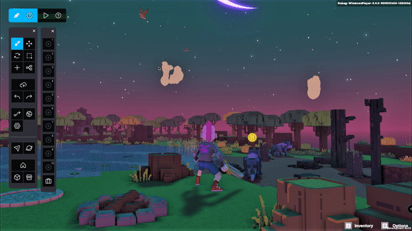
The Sandbox
Game Maker UI Redesign (Conceptual)
While exploring user-generated content (UGC) tools for metaverse platforms, I used The Sandbox’s Game Maker tool to create land and an animated character to inhabit that land. In this process, I was struck by the difficulty of using the tools, which were marked by confusing UI and workflow. As I recorded my observations and experience, I began forming a concept design for UI improvements for the tool.
Problem
The main issues I encountered:
Functional UI is spread to all sides as well as the middle of the screen, taking up valuable space that could be used for viewing the resulting creation
Associated functions not grouped together, hierarchy unclear
Inefficient UI layout increases cognitive load (user has to look for buttons spread over all corners of the screen and move cursor from end to end to navigate between functions)

Current Sandbox Game Maker
Solution
I took a look at some competing platforms as well as taking my own irritations into account, and put together a solution focusing on the following aspects:
Use UI space more efficiently; maximize creation/viewing area
Better functional grouping and hierarchy of buttons, to make UI easier to learn and more efficient to navigate
Clearer visual distinction between Edit mode and Play mode
Consistent icon set to replace different styles of icons as well as variations between buttons with text and buttons with icons
Conceptual redesign to better organize the UI, maximize creation/viewing space and more clearly distinguish the playing and editing modes
Prototype
I also created a prototype as a sanity check; it gave me a better sense of how the changes actually worked and felt. It demonstrated switching between play and edit mode, navigating the more efficient UI, selecting an item while in edit mode, as well as accessing the asset inventory and functional shortcut guide.

Apple Support
Online support experience
At Apple, one of my first projects was to design the online support experience for the first iPhone in 2007. This started with the product support page and extended to troubleshooting and mail assistants, as well as the repair flow and repair status email template. In addition to this blockbuster product launch came a redesign of Apple.com in the new "Everest" style as well as the elevation of Support to a top-level tab on the site.

In 2010, to coincide with the launch of the original iPad, I led the redesign of the product support pages, which was part of another Apple.com revamp to a more touch-friendly design.

The framework of that design from 2010 still runs strong in today's product support pages.


Overstock
Product Page Redesign
At Overstock, one of my early projects was to lead the redesign of the product page to enable larger product images as part of the effort to increase purchase conversions and reduce bounce rates. This effort was not just a template redesign but a pilot project for modernizing the product development system, processes and teams in order to speed development and encourage experimentation.

I led a 5-day design sprint in San Francisco with the product team (including VP of Product, lead engineer, lead UX designer, visual designer and front-end developer) where we conducted competitive research, prioritized goals, requirements and features, and developed a working prototype.


As the project progressed, I maintained the product vision and worked with the team to implement the design. Outside of revenue gains since the project launch, the greater gains were changes in organization, processes, technologies and UX staffing as well as a redesign of the entire site that is still ongoing.


Media Options
Email Newsletter Redesign for #1 Domain Broker
Leading domain investor Shane Cultra requested that I do a redesign to improve the usability of an email newsletter he’d just received from his friends at Media Options, the #1 domain broker in the world. In a few hours, I completed and shared a Figma with Shane containing an analysis of the current issues, as well as a design that addressed those issues. A few days later, the Media Options team had updated their email newsletter template with the new design and sent out their latest email. I received thanks and acknowledgement that was tweeted out by the COO and Media Options’ official Twitter/X accounts.
Problems
The visual grouping and colors were “brutal on the eyes”
The list of domains used repetitive text that made the list difficult to scan quickly.
Additional content such as blog posts and podcasts had repetitive descriptions and proportionally little to call out what was new and why users should click through for more.
Solutions
I made the following changes to make the newsletter content easier to scan, quicker to read and drive more action.
Domain Deals list: Removed repetitive text, divided the list into two sections: domains with prices and without, and sorted both sections alphabetically to speed scanning. Added CTA buttons which served both to drive contacts as well as visual separators between sections. Also moved call to action content from the very bottom of the email to immediately after the Domain Deals list.
Blog and podcast sections: Reduced the long descriptions to single paragraphs that called out what was new or unique about the content, which was helpful for distinguishing between the episodes of a series.
Visual design: Reduced visual noise, introduced separators (using brand orange) to make it easier to visually scan from section to section, while also help one find one’s place in a very long email, esp. on mobile. Provided both light and dark mode designs.
Typography: Introduced consistent heading, subheading and body sizes to clarify visual hierarchy.
This is a block field
You can put any content in here.
Etiam porta sem malesuada magna mollis euismod. Vestibulum id ligula porta felis euismod semper. Maecenas sed diam eget risus varius blandit sit amet non magna. Vestibulum id ligula porta felis euismod semper.